Hey everyone! A little while ago I was accepted into Sheridan’s Honours Bachelor of Animation program for the graduating class of 2025, with a 94% portfolio score!
This was my second year applying, I was rejected last year with a 68%, then did lots of practicing, along with Sheridan’s art fundamentals program and tutoring, and then was accepted with a 94% this year!
This year, the cut off for domestic students was 89% and the cut off for international students was 95%.
Bellow is my scoresheet and portfolio, with notes on each section about what the section required, why I may have lost and gained marks, and things to look out for when creating your portfolio. I hope this helps future applicants, and best of luck to anyone applying!
I also created a video with a more in-depth look at my accepted portfolio, along with a comparison between my rejected 68% portfolio from last year, and my accepted 94% portfolio from this year, my experience with Sheridan’s Art Fundamentals program and my experience with tutoring. You can find that video directly bellow! ↓
SCORESHEET
MY SCORE: 94% DOMESTIC CUT OFF: 89% INTERNATIONAL CUT OFF: 95%
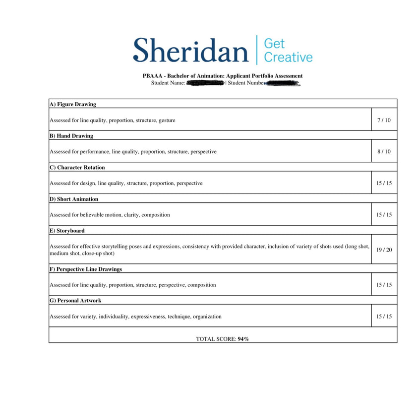
FIGURE DRAWING
7/10
This year we had to do four figure drawings, with two short poses from 1-3 min that focus more on gesture and movement, and two long poses from 5-20 min that focus more on structure and anatomy. All four of my drawings were done with conté on newsprint paper. For my drawings, I tried to focus on proportions, gesture and structure! This section was definitely the weakest section of my portfolio, so I’m not at all surprised with the mark.
I think I lost marks because:
- The line quality wasn’t great, the lines were overall too dark and there wasn’t enough line variation.
- I feel like the proportions are a bit off on both short poses and long poses. I often make my heads too big, as well as the legs are usually too short compared to the torso.
- Not great anatomy, some limbs were definitely over-simplified and appeared more tube-like then they should have.
HAND DRAWING
8/10
This year we were asked to do two hand drawings, one that is anticipating the action and one that is carrying out the action. The action this year was tossing a small object (like a dice, coin) down onto a surface, either gently or with force. Both were done traditionally with blue pencil, and I tried to focus on the interior structure of the hands, as well as proportions, line quality and dynamic poses! I also tried to show both the back side (dorsum) and palm side (palmer) of the hand.
I think I lost marks because:
- My anticipating action was a little stiff, it definitely could have been more exaggerated and dynamic.
- I also think the hand action was a little odd, I’m not sure how well the two actions flowed together.
CHARACTER ROTATION
15/15
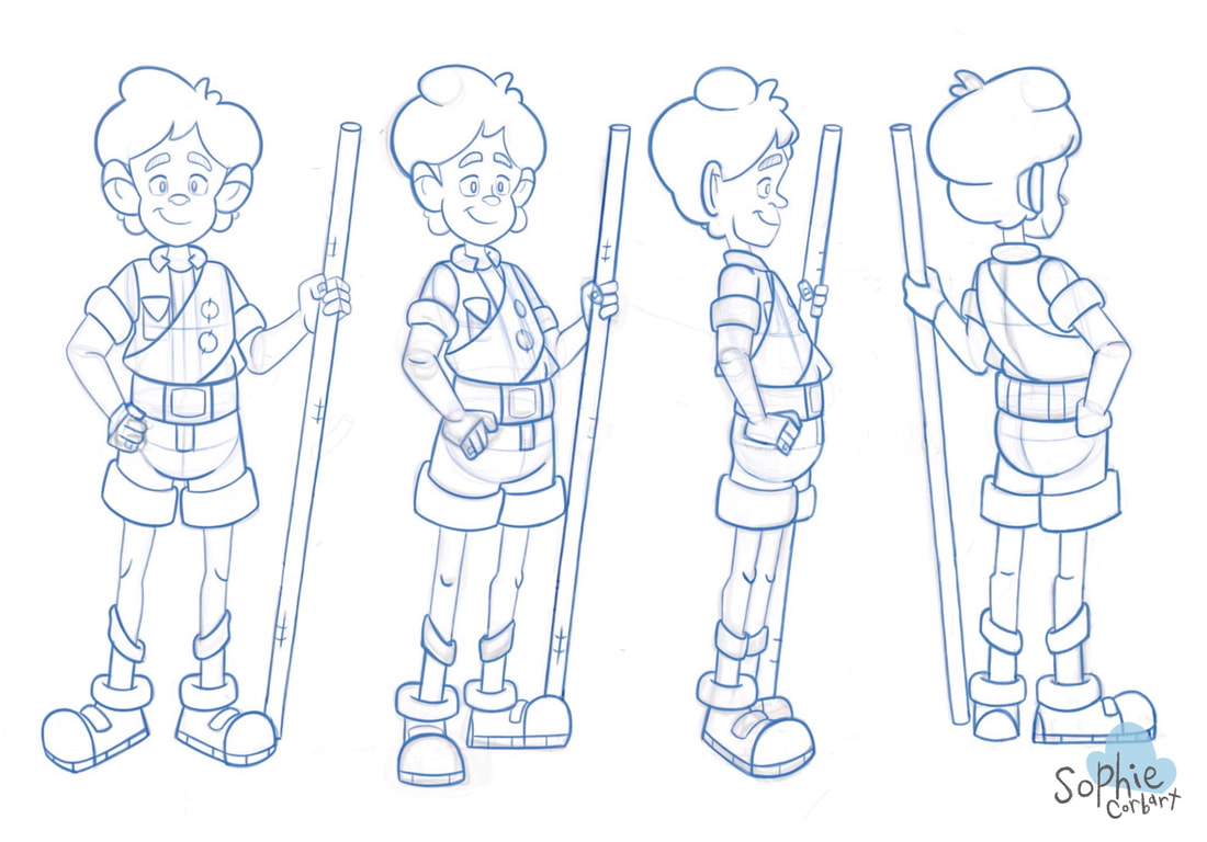
I am so happy with how this piece turned out! I did this section digitally, and it was the section that I probably spent the longest on. This year, we were asked to pick an original character and rotate it in four positions (front view, 3/4 front view, side view and 3/4 back view).
- For this section, I really tried to focus on the overall design of the character- not too complicated, and also portraying a certain amount of story.
- I also tried to show the interior structure of the character in all four poses, to show that I understand how my character rotates. I started by rotating the larger aspects of the character first, and then went through with the details later. That way, I could make sure everything is consistent before going in with even more elements.
- I included as much line quality as possible, with darker lines in places and lighter, thinner lines in others.
SHORT ANIMATION
15/15
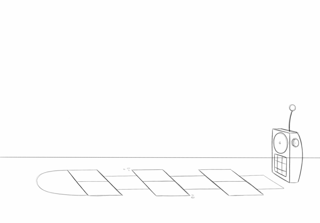
I am very happy with my mark! I did the entire animation in procreate with the animation feature. This year, they gave us the character and reference sheet of a walkie talkie, which is basically like last year’s character (a juice box) but with an entente instead of a straw and a slightly different shaped box.
- I tried to focus on some of the animation principles, like squash and stretch, as well as keeping a consistent volume throughout.
- I thought it would be fun to animate the character doing something recognizable, to help make it more original, so I had it playing hopscotch!
STORYBOARD
19/20
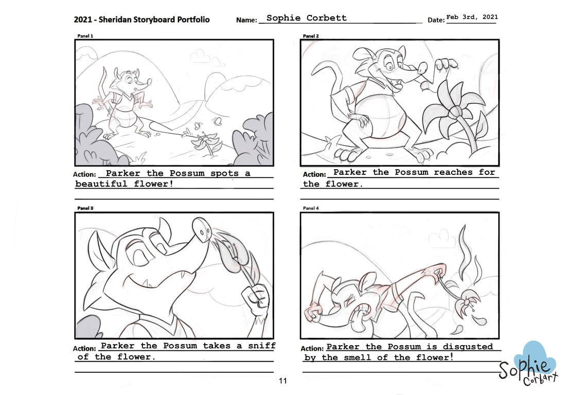
This year they changed the marking of the storyboard to be out of 20 points instead of 25, and the character they gave us to use was the possum. I was really nervous about this section, as I got a couple of critiques saying that the camera didn’t move around enough, and that the two last shots were too similar. Thankfully, they seemed to like it and I only lost one point!
- For my storyboard, I tried to show a variety of shots: with a long shot, close up shot, mid shot and a shot from the ground looking up.
- I also made sure to keep the character on model, and tried to have my shots follow the 180 rule (which means not having the camera completely change sides every frame and allows the shots to flow well together).
- Readability is also really important- you should be able to tell what is happening in the frames without needing words or explanation.
- I also tried to show exaggeration in his actions and to have different facial expressions in every single shot.
I think I lost a mark because:
- Like I mentioned previously, the last two shots were pretty similar. Even though one shot was a close up, and the other a mid-shot, I probably could have pushed the shots even further.
- The background probably could have been more consistent.
- There was a lot of extra space above possum in the fourth frame, which I was told was something you don’t want to have in your shot.
PERSPECTIVE LINE DRAWINGS
15/15
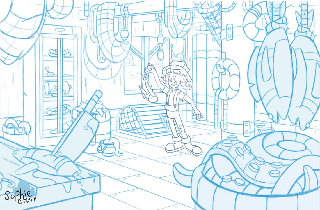
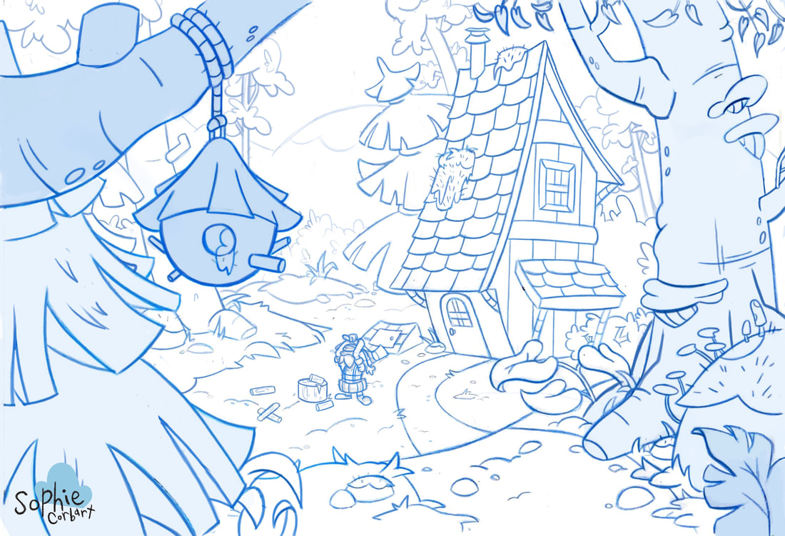
This year they asked us to do two layouts; one interior, and one outdoor environment, both with at least one character in it. For my layouts, I did them both traditionally with a blue pencil, used a long yard stick ruler to check perspective, then scanned them and used procreate to clean up and add the character. My interior layout was based off of an ocean side tackle shop, and I tried to add lots of props and objects that would help give off the nautical appearance. For my outdoor layout, I based it off a forest/cabin in the woods environment. It was a more stylized nature feel, but still had natural elements and multiple planes to help show distance.
- I researched a bunch of resources to help with the props and the feel of both environments. I also included characters that fit with both environments.
- Both layouts had darker lines for the closer objects, and lighter lines for the objects farther away, to help show distance.
- Both layouts have open planes for the characters to move around and interact with their environment. As well, both were also relatively evenly balanced, and one side wasn’t busier then the other.
PERSONAL ARTWORK
15/15
And last but not least, personal work! This section is where you are able to show off your skills and techniques for drawing, painting, character design, sketchbook, 3-D etc, and to set yourself apart from the other thousands of applicants. For everything I submitted, I tried to think of what you would include if you were applying for an animation job, and leave out things like life drawing and lots of realism.
Above: Layout Compilation
For the first submission, I submitted a layout compilation pdf, which was a combination of layouts I had done for my rejected portfolio last year, and new ones I had created throughout the past year. I didn’t really think any of the layouts were particularly strong enough to be its own submission, which was why I grouped them together into one pdf submission.
For the first submission, I submitted a layout compilation pdf, which was a combination of layouts I had done for my rejected portfolio last year, and new ones I had created throughout the past year. I didn’t really think any of the layouts were particularly strong enough to be its own submission, which was why I grouped them together into one pdf submission.
|
Right: Character Line-Up For the second submission I submitted a character line-up pdf, one that was line work focused, and one that had the basic character colours. I had done some research previously into how to make a strong character line up (which included having different sized characters together, lots of different exaggerated poses, lots of different personalities etc) and made sure to try to use these suggestions in my own line-up for the portfolio. |
|
|
|
Left: Character Exploration Notebook
For the third submission, I submitted a character exploration notebook pdf, which was basically a collection of two characters from one story, some of their expressions, some of their props that they use, and some of the colours that would be used for their design. I compiled the two explorations into a sort of digital scrapbook-like design, so when you would look through it, it gives off a scrapbook vibe and I thought was also a creative way to compile a character exploration! |
Above: Digital and Traditional Sketchbook Compilation
For my fourth submission, I submitted a digital and traditional sketchbook compilation pdf, which is basically some digital and traditional sketches that I complied and fit together in small categories to make a sketchbook-like design for them to look through. I tried to submit a range of different medians and different topics, like a digital painting and traditional watercolour observation sketches, to show some understanding of painting and colour, pencil observational sketches, and process work from the layout section.
For my fourth submission, I submitted a digital and traditional sketchbook compilation pdf, which is basically some digital and traditional sketches that I complied and fit together in small categories to make a sketchbook-like design for them to look through. I tried to submit a range of different medians and different topics, like a digital painting and traditional watercolour observation sketches, to show some understanding of painting and colour, pencil observational sketches, and process work from the layout section.
Bellow: Short Animatic
For my fifth and last submission, I created a short animatic roughly about a couple of days before I submitted. This animatic is super rough and kinda rushed, but I wanted to create it to show some of my interest in storyboarding!
For my fifth and last submission, I created a short animatic roughly about a couple of days before I submitted. This animatic is super rough and kinda rushed, but I wanted to create it to show some of my interest in storyboarding!
THANK YOU FOR READING!
And that’s my full accepted Sheridan animation 2021 portfolio! Please feel free to ask me any questions, either on my Instagram @sophiecorbart, or my email at [email protected], and I’ll try my best to answer them. Best of luck to future applicants!
And that’s my full accepted Sheridan animation 2021 portfolio! Please feel free to ask me any questions, either on my Instagram @sophiecorbart, or my email at [email protected], and I’ll try my best to answer them. Best of luck to future applicants!
